end-to-end process
Redesigning the Services section
The AXA Health app is designed to help employees take small, incremental steps to improve their lifestyles and become the best they can be.
Keeping up with the app's growth and the number of services offered, it was observed that the current design couldn't accommodate such expansion. The business requested the creation of a design solution to address this need.
Client: AXA Health UK
Year: 2023

Collaborative project
This project lasted about 3 months in total. I worked on this project as the Digital Product Designer, alongside other UX designers, UX Researchers and Developers.
I was responsible for part of the research, user interface design, wireframing, workshop facilitation, prototyping, user testing on Maze, data analysis & insights and playback to diverse teams.
Disclaimer: Under A Non-disclosure Agreement. Some of the details and images in this case study may be vague to protect the client's intellectual property.
The challenge

First and foremost, it is important to clarify that the main objective of the app up to this point was to provide wellbeing support for corporate users. As such, access to the services that this user was entitled to was not of primary relevance in the information architecture.
The business requirement was to increase the number of services offered; but, the current design would not provide a good user experience, considering the large number of offerings (going from 9 services to at least 18 in the short term).
However, based on previous research, I was aware of feedback from users expecting more prominent access to services, and finding the Home Page navigation confusing.
Therefore, I took these insights and data into account and aligned them with the stakeholders' expectations to redesign and improve the way the offered services are presented within the app.
Summary
What was delivered and how
Services
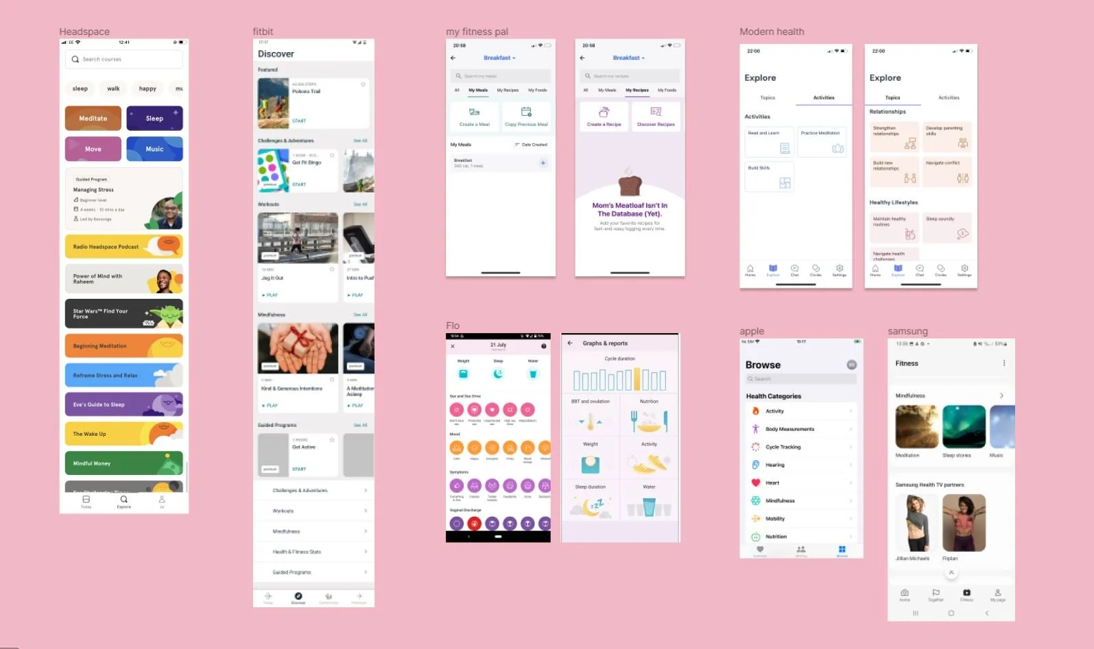
Competitive analysis
Workshop facilitation
Wireframing
Mobile app design
Daily alignment
Design review on QA environment
Playbacks to the Stakeholders
Accessibility checks
Deliverables
User interface design
Card sorting
Wireframes & Micro animations
Mockups & Prototypes
New components for the Design System
Detailed handover
Insights from the user testing (via Maze)
New icons (illustrations)
Outcomes
We achieved a completion rate of 74.4% with users directly or indirectly completing the established tasks.
We also enhanced user understanding, leading to design decisions more aligned with their expectations.
Accessibility aspects were taken into consideration prior to development, streamlining our process by preventing post-launch rework.

Problem statement
How might we redesign the way we display the Services to allow for easy findability of all services the user is entitled to, while also being a sustainable solution for the long term?
The approach
Desk research
Through meetings with stakeholders, I was able to grasp the peculiarities of each service we offered and learned that we were mixing different topics and levels, which could lead to user confusion.
I also conducted an analysis of the comparative research, recently produced by the UX team which involved studying 10 companies in the health and wellness sector, focused on how these products organize their services. And the main finding was the consensus is the categorization of the offered services.
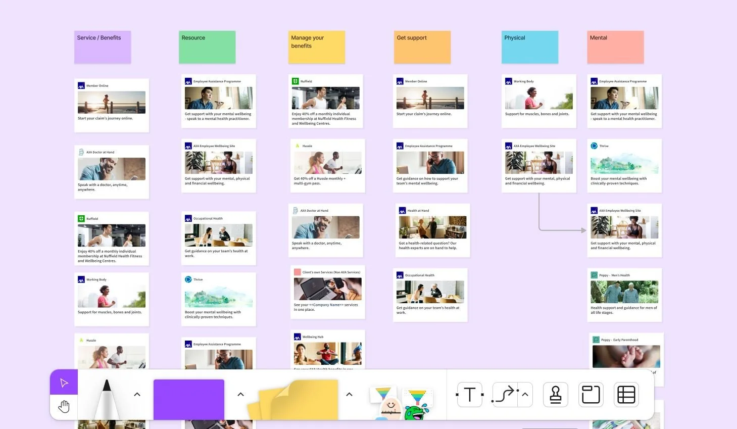
Card sorting
Categories names and how to group services
In total, approximately 70 participants took part in the various Card Sorts I conducted, including both moderated and unmoderated, as well as opened and closed versions. Through these sessions, I confirmed my assumption about the challenges users faced in grouping the Services and also identified certain descriptions that weren't clear enough for them.
After collecting the data, I presented it to the Marketing team, who further refined the categories based on how the company presents them across the business.
I took the lead in conducting the card sort workshops and tests, with the support of the UX Lead and UX Researcher, to structure the process and gain valuable insights.
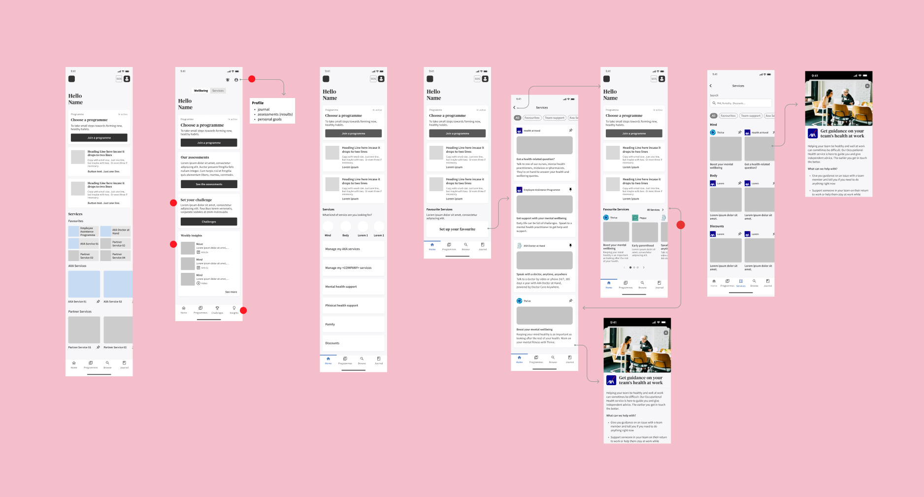
Rapid wireframes
concept test & Iterations
Returning to the findings from both the previous and recent research, I concluded that making changes to the Main Navigation and creating a dedicated page for services would enhance usability and provide a sustainable solution for the future of the app.
To validate this approach, I conducted a usability test using a Figma prototype with an internal audience of 5 people. Based on the test results and discussions with stakeholders, we made the decision to narrow down the design scope to focus on essential elements for the first implementation phase, while planning to address additional features in subsequent phases.
Accessibility
Improving Inclusion, a Continuous Effort
Another key objective we have been pursuing is to enhance the inclusivity of the app. To address this, I have initiated Accessibility audits before handing over to the developers.
These audits focus on elements such as colour contrast, ensuring legible text size & large text, evaluating carousel functionality (previous and next buttons), and taking into account cognitive aspects, such as avoiding text-heavy content based on user feedback from individuals with dyslexia.
By incorporating these measures, we aim to create a more inclusive and user-friendly experience for all users.

Teamwork

I led design workshops with the UX team & stakeholders and also '3 amigos' sessions with devs to identify constraints, promoting collaboration, beyond joining weekly meetings with the Product Owner to maintain alignment.
This strong teamwork was crucial in optimizing the workflow, preventing unnecessary focus on features beyond the scope.
And also, ensuring the best possible implementation of essential elements. The combined efforts and coordination allowed us to achieve our goals efficiently and effectively.
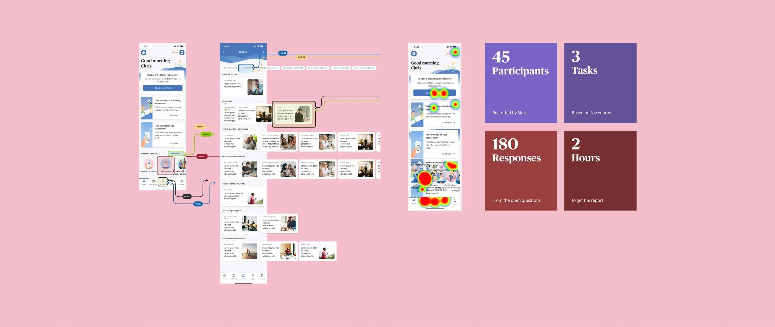
High-fi & Usability test
My subsequent endeavour involved embarking on a journey to refine the app, elevating it to a high-fidelity version that resonates deeply with user experiences.
My commitment to excellence extended beyond the realms of development, as I rigorously assessed its usability and functionality.
Through an unmoderated usability test, conducted with 45 diverse participants via the Maze platform, we gained invaluable insights into the application's real-world performance. This approach underscores our unwavering dedication to delivering solutions that seamlessly blend advanced technological expertise with user-centric design.
The solution

The outcome of this project coincided with a product strategy shift, which aligns with the research findings from our UX team. Consequently, I repositioned the Services section on the Home Page to the top of the page, organized the Services into categories, and added a new dedicated page for the offered services, providing users with various access options.
To validate the new interface, I conducted a final unmoderated test on Maze with 45 participants, using the Figma prototype. Analyzing the results through percentages and heatmaps,
my assumption was that approximately 70-85% of users would be able to complete the tasks, though they might still encounter difficulties with the information architecture.
As a result, we achieved a completion rate of 74.4% with users directly or indirectly completing the three established tasks. With this positive outcome, I proceeded with the handover to the DEV team, and the final design can be seen below.
The outcome
Respecting the NDA, I cannot disclose specific details about the current results. However, I am pleased to inform you that following the feature release, approximately 80% of the Services experienced an increase in user access within the two subsequent months.
We will continue closely monitoring and tracking these results while reviewing the Key Performance Indicators (KPIs) to ensure that we continuously improve the app's performance and user experience based on valuable insights and data-driven decisions.